Chargerless
Chargerless makes Ray, a fitness tracker that runs on light. I redesigned the product page, built the configurator, ran paid acquisition and set up the tracking.
- Relationship
- Independent consulting
- Year
- 2026
- Business
- Hardware, sold direct
- My part
- Design, front end, paid acquisition, tracking
The page before and after
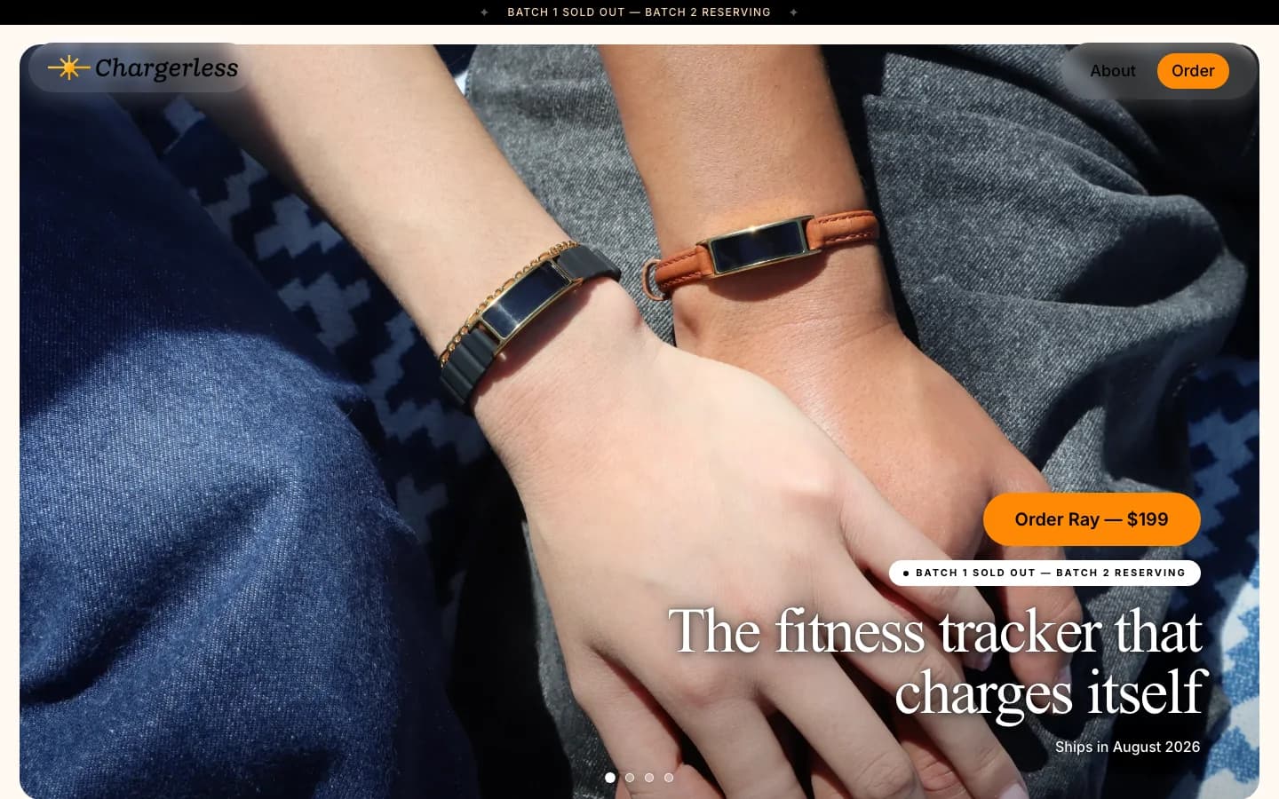
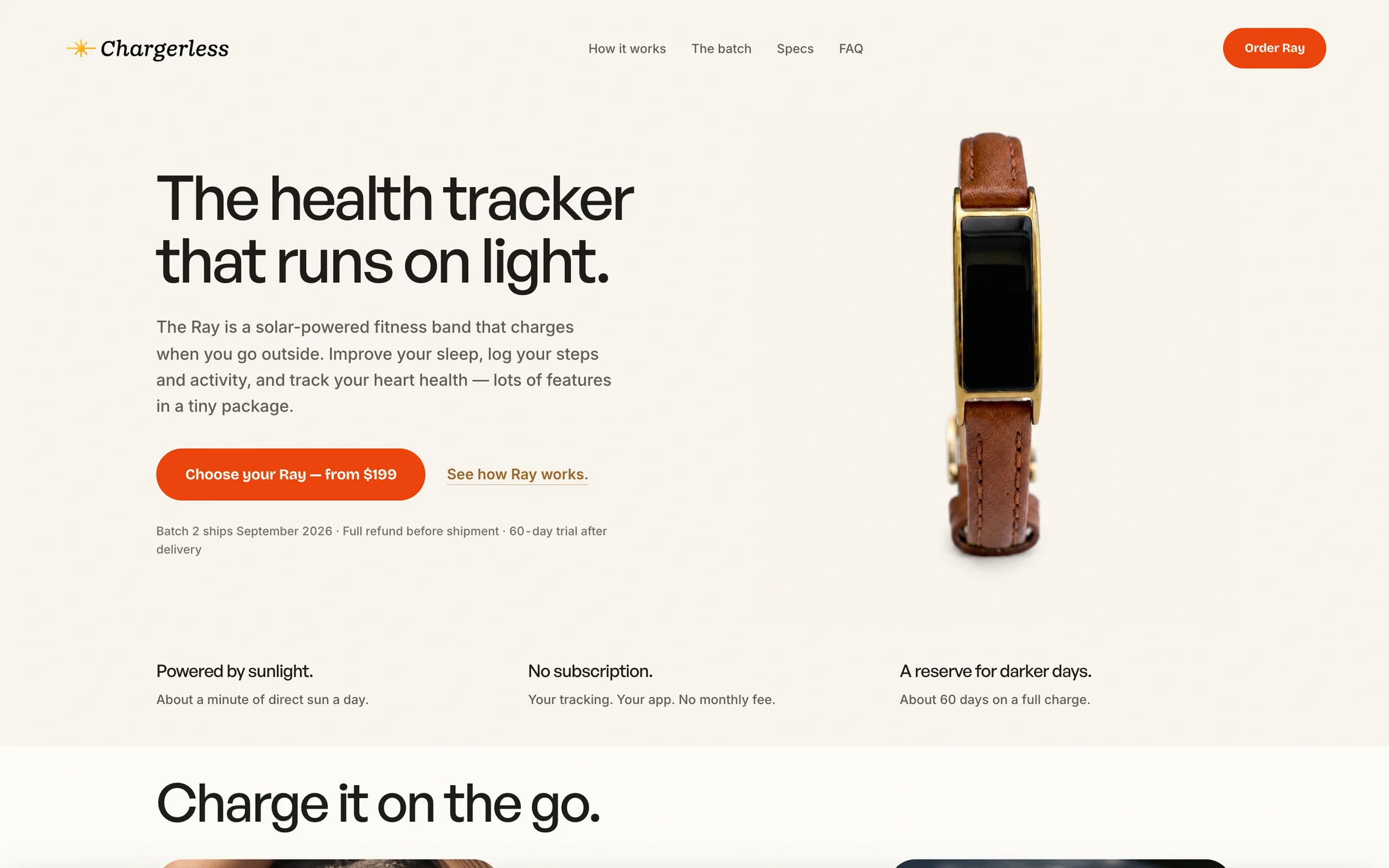
The first is the homepage as it stood in June 2026. The second is the product page in September 2026.
Which is clearer, 1 or 2?
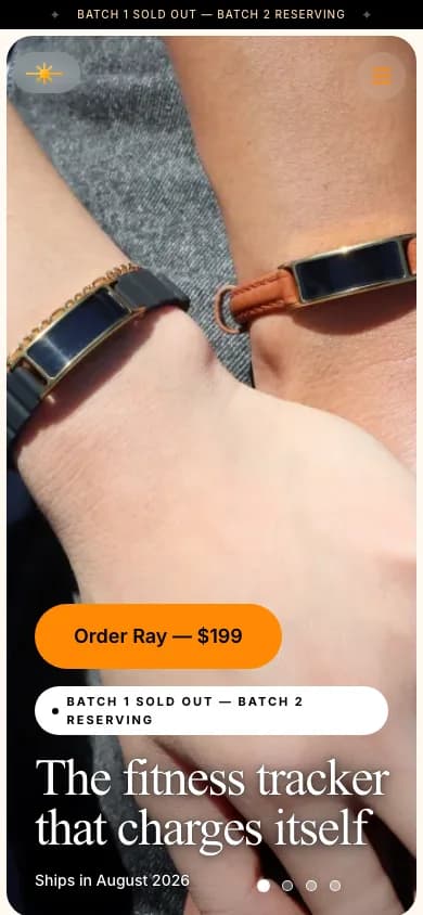
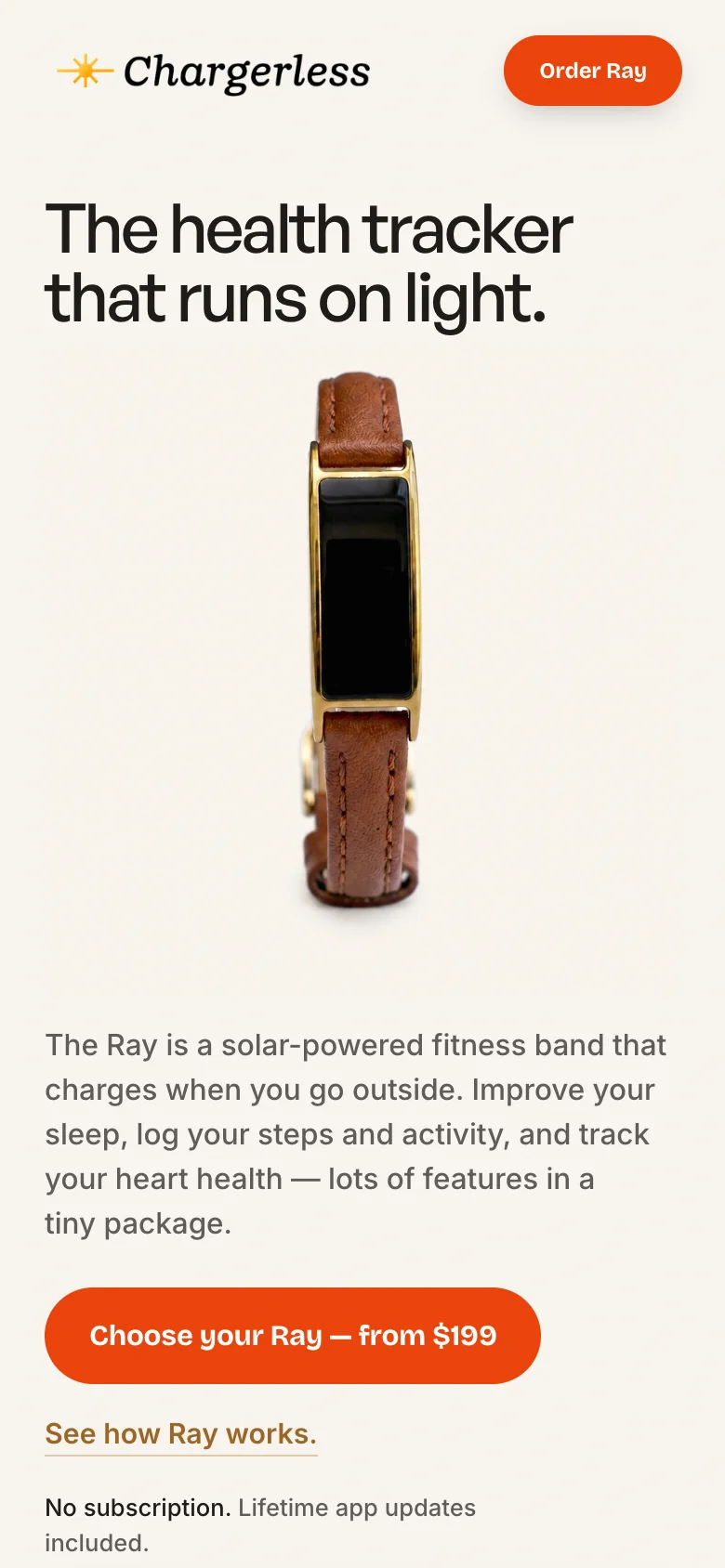
On a phone
What the first screen does now
- The headline says what the product is in seven words, on a plain ground where it can be read.
- The order button carries the price. The only other strong colour on the screen is the same action in the nav.
- Ship date, refund and trial sit directly under the button, which is where the hesitation happens.
- One object to look at. The June page opened on a lifestyle photo with the text laid over it.
- Three questions answered before the first scroll: how it charges, whether there is a subscription, and how long it lasts.
The configurator
Finish, band and size are three separate choices, each shown with what it changes. The order bar stays in view with the running price, so the next step is always one tap away.
4×monthly unit sales in the first full month of the engagement
What moved
Monthly unit sales more than quadrupled in the first full month I worked with Chargerless.
That is a company-wide number. The page, the ads and the tracking all changed in the same period, so I can’t split the result between them, and the captures on this page show the design, not a controlled test of it.
Which is easier for you, 1 or 2?
Or email david@heyspiegel.com